


[01]
[02]
[03]
[04]


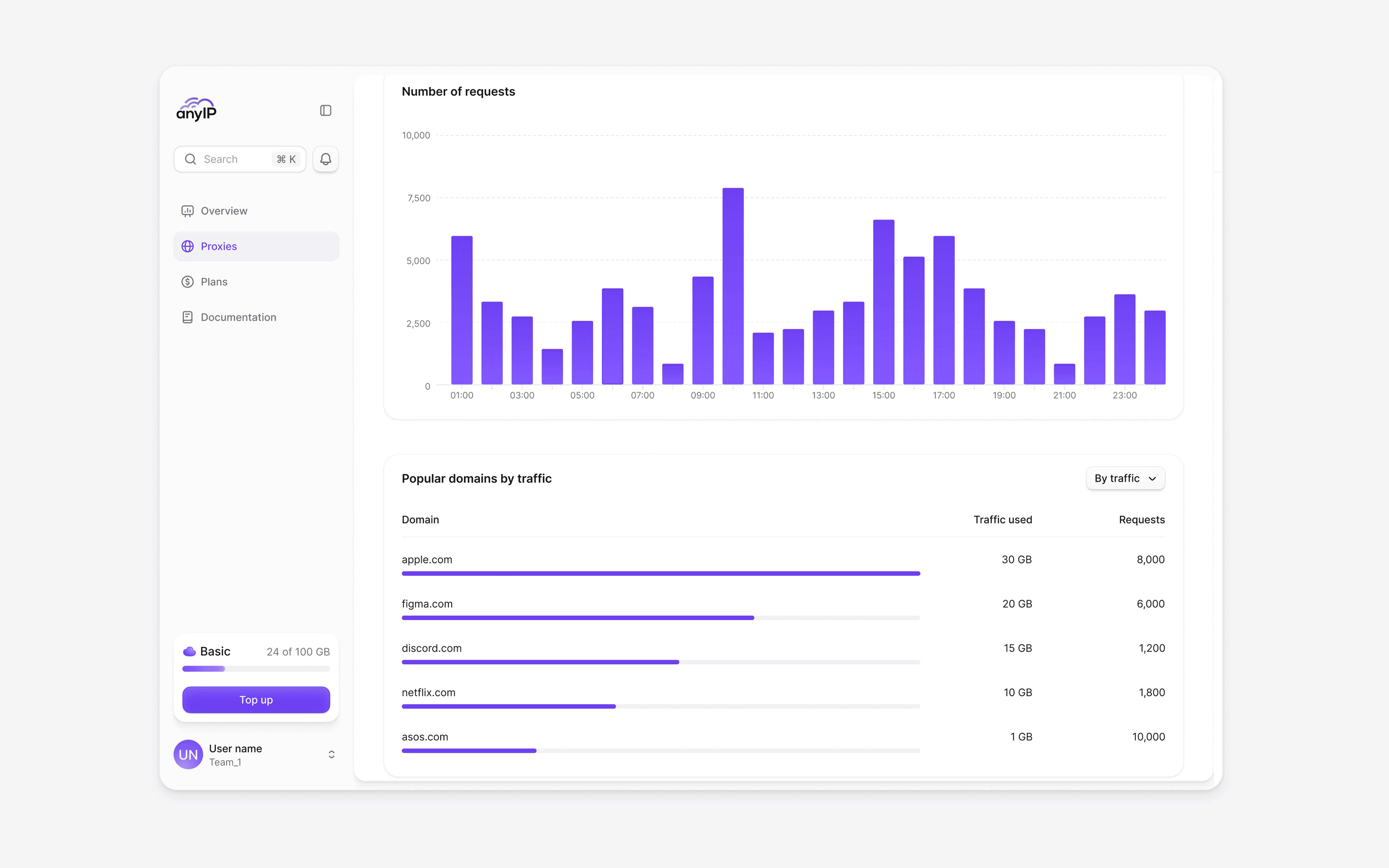
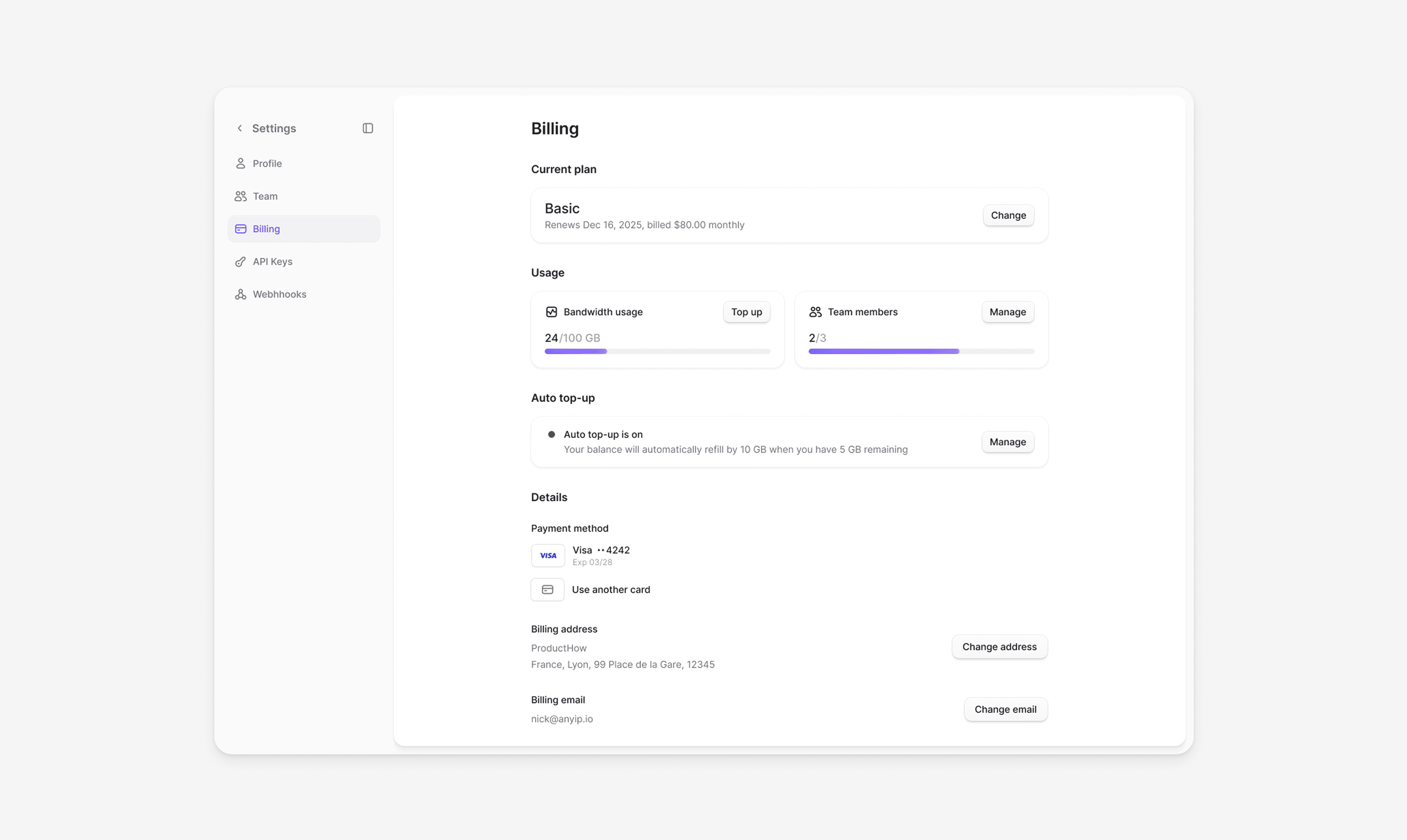
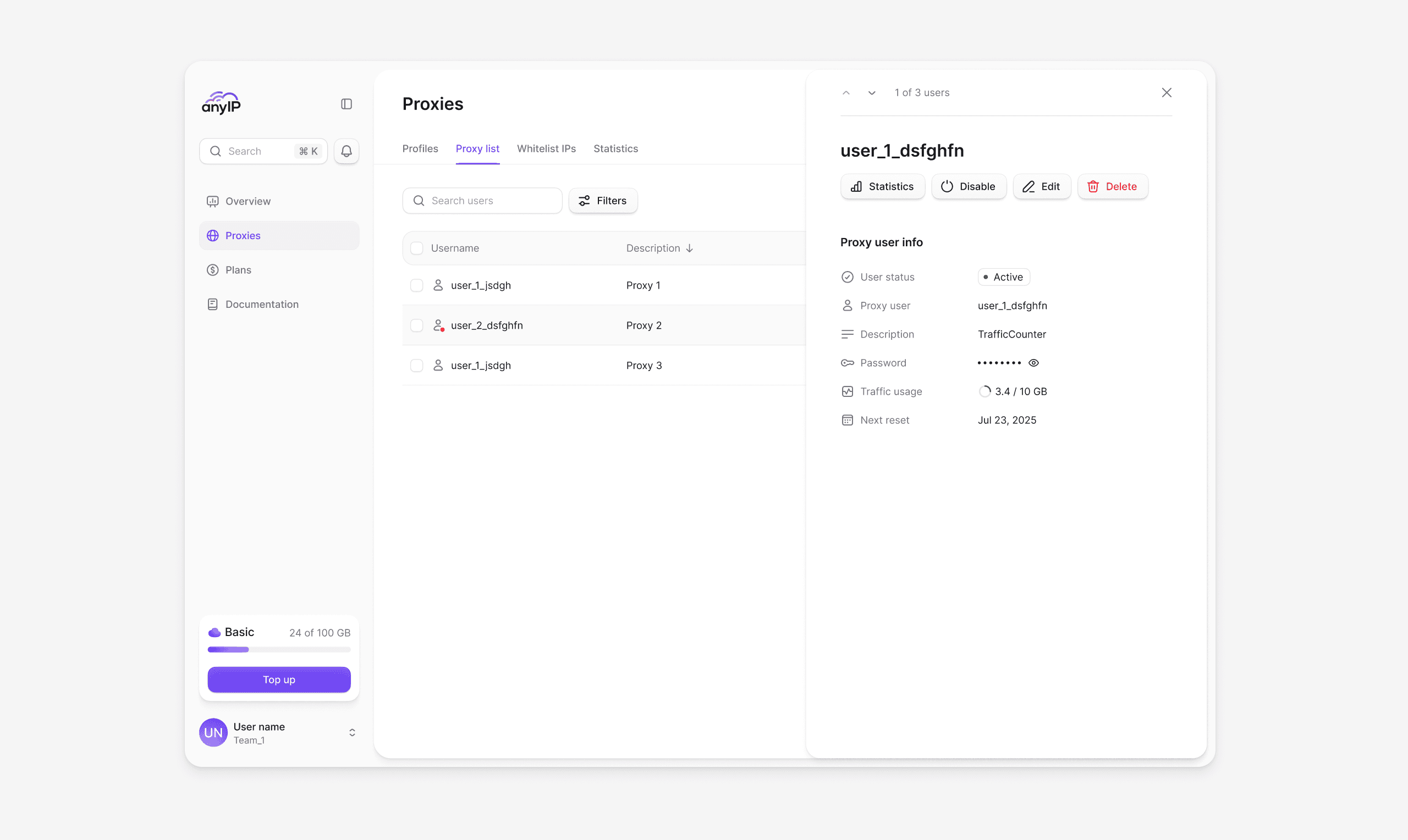
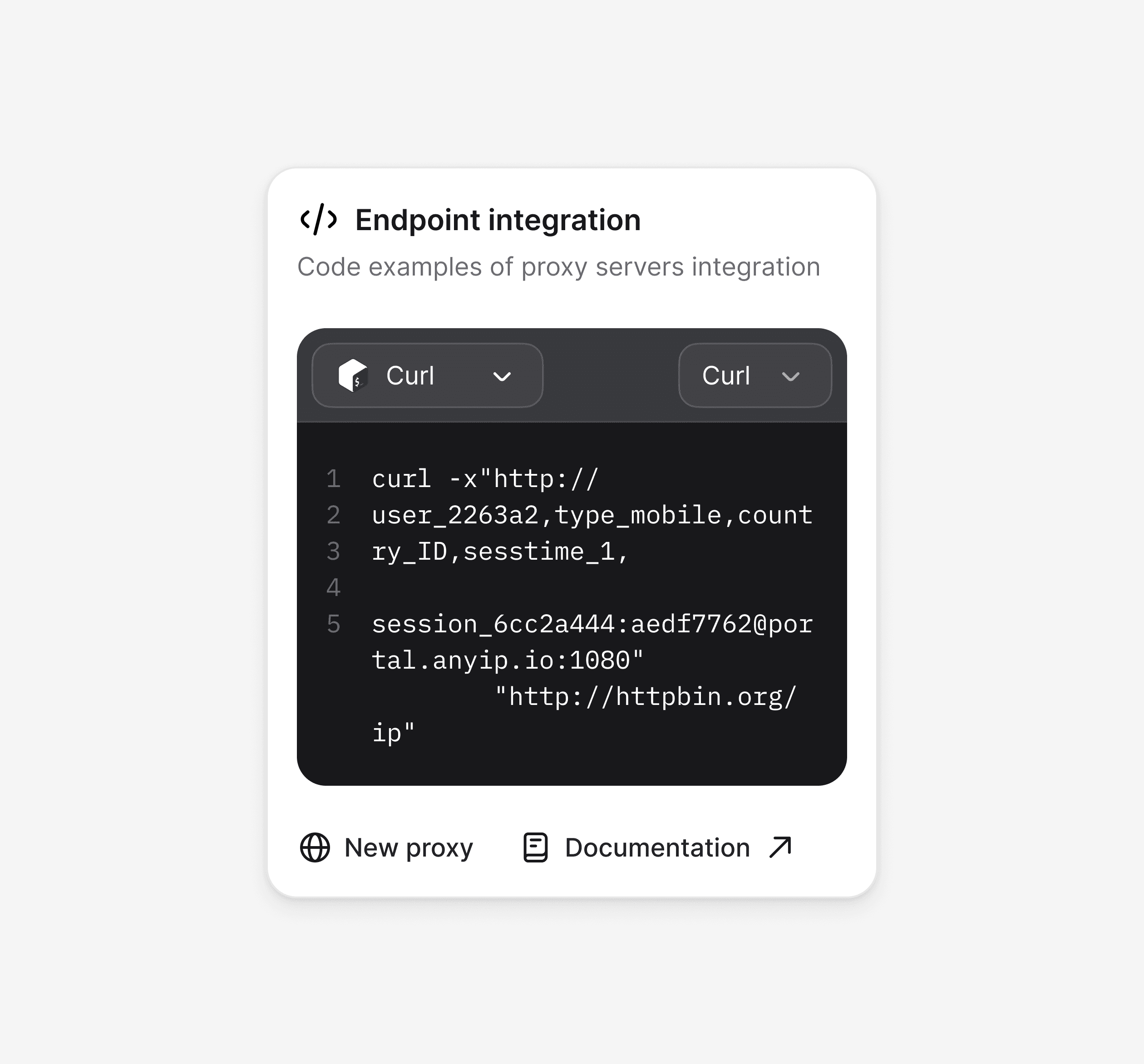
The proxy section is where most of the work happens. We designed it to support scale without adding friction, from managing hundreds of profiles to controlling access and tracking usage. Everything stays organized and easy to navigate, even as complexity grows.


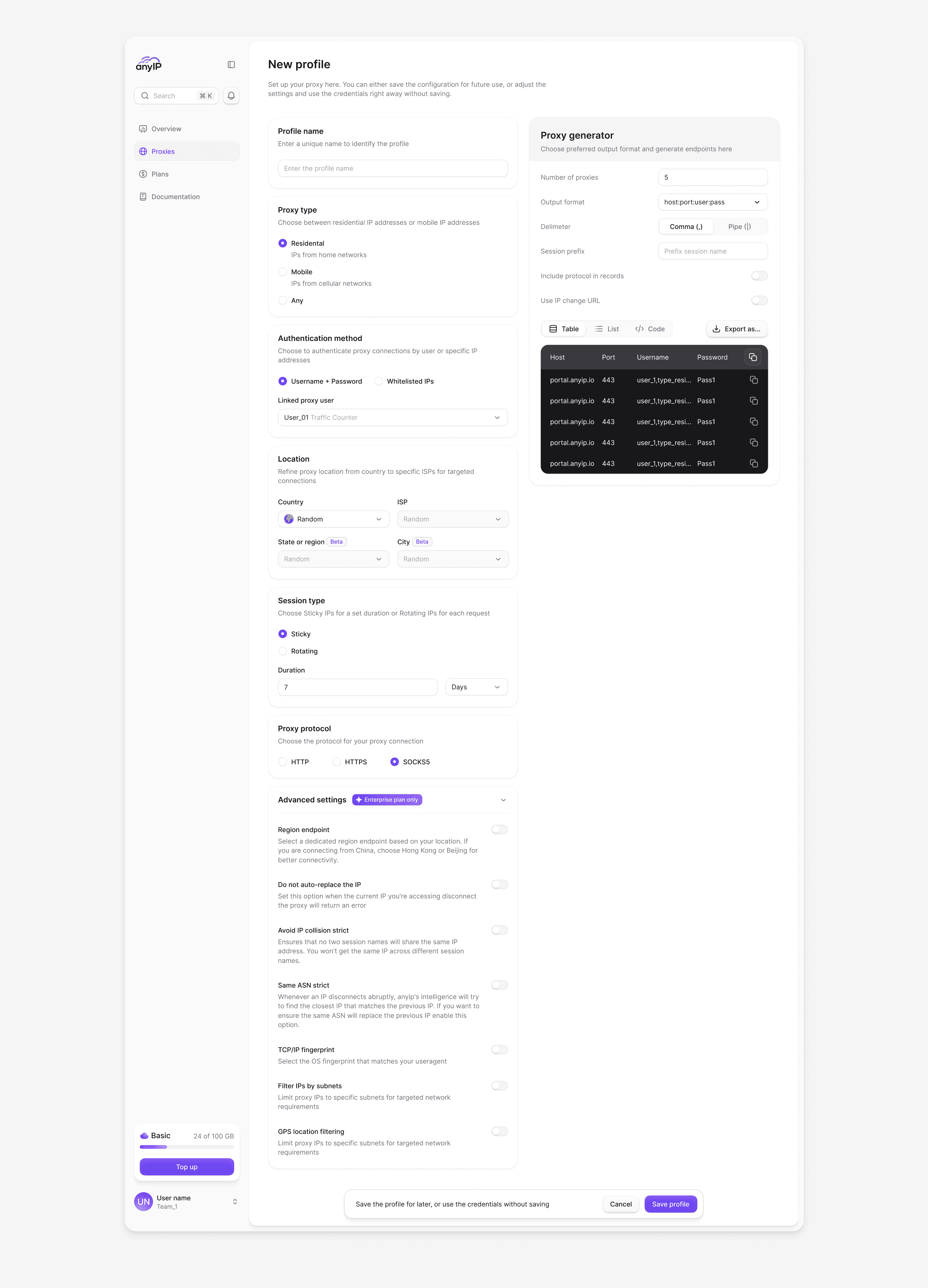
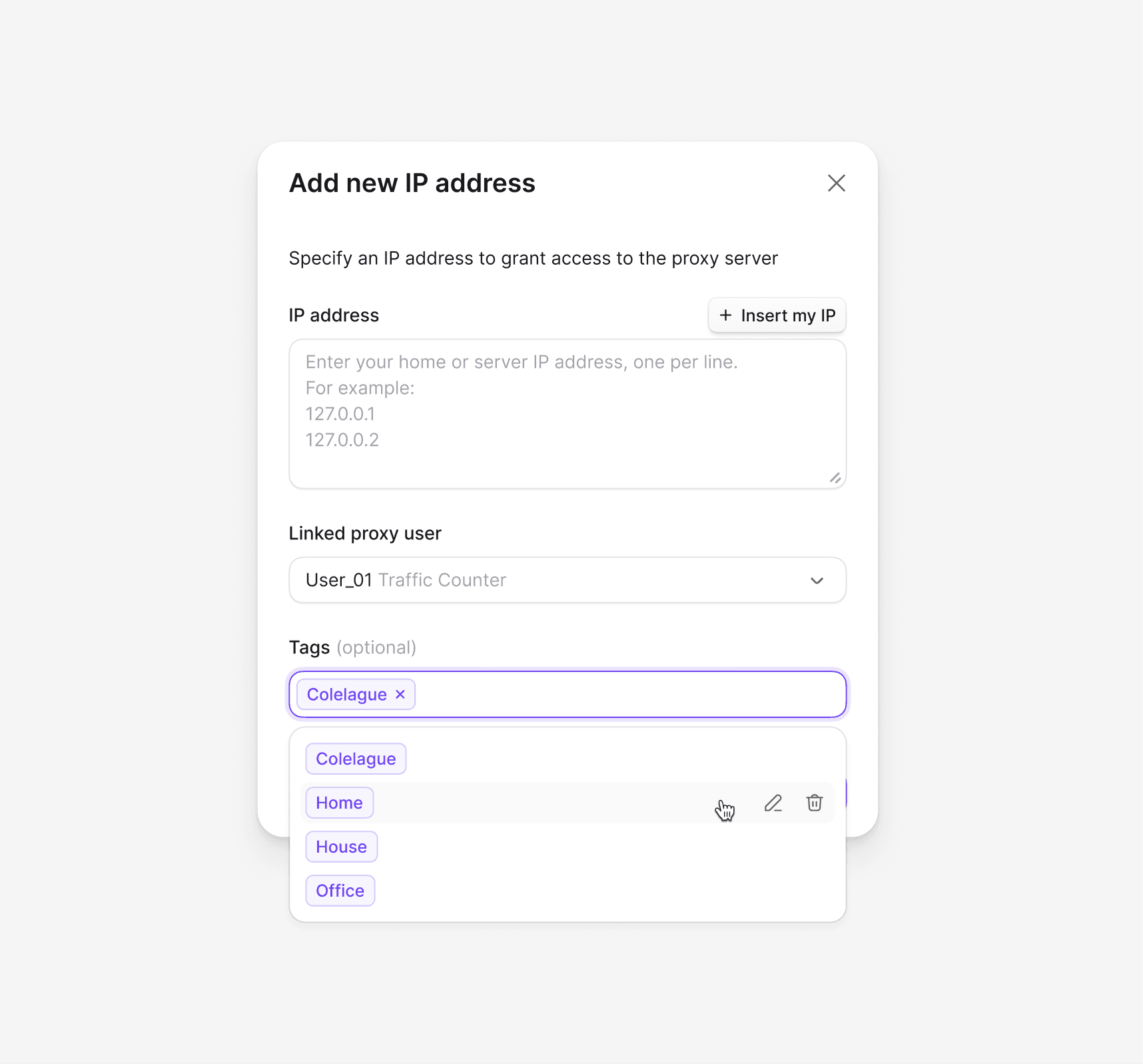
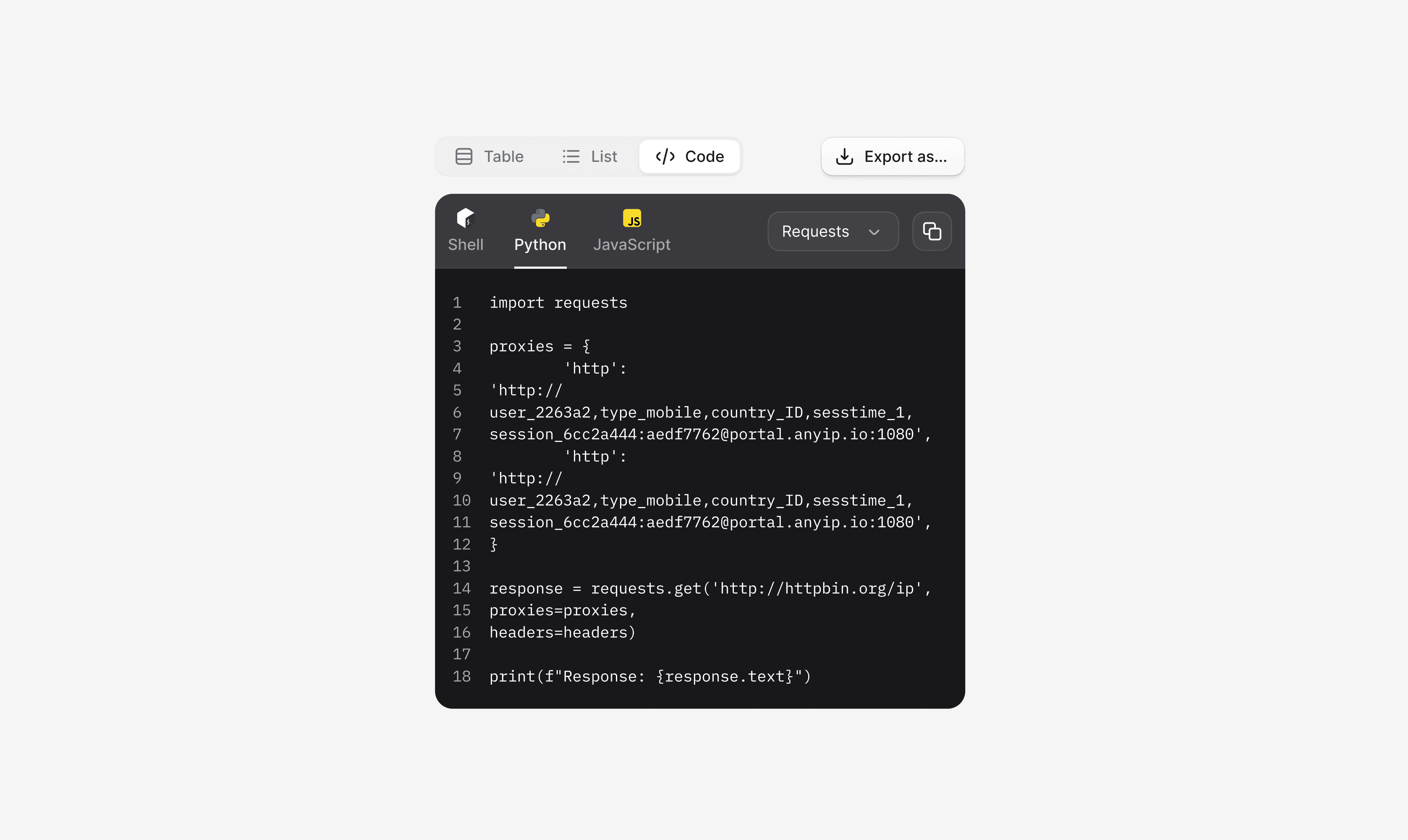
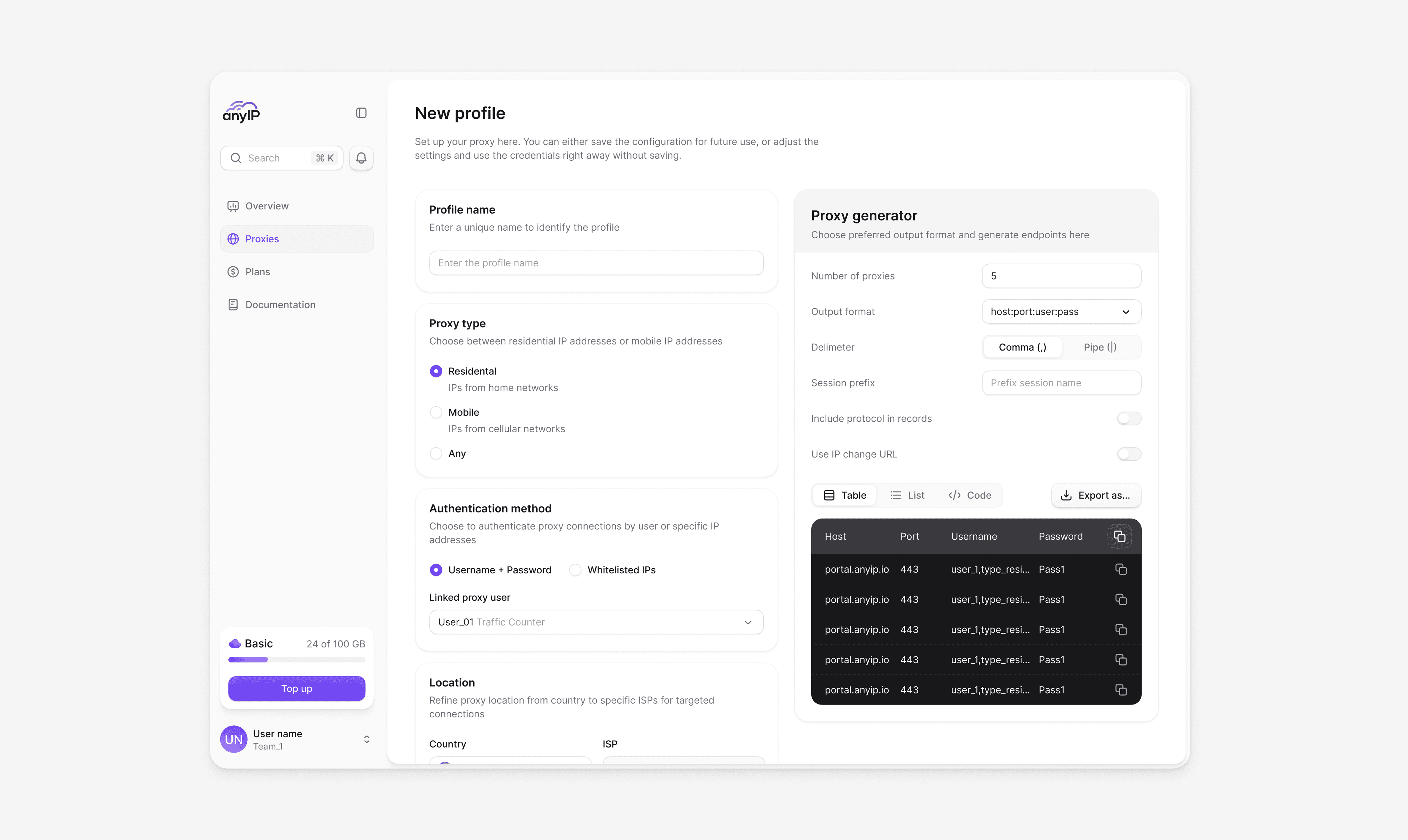
Creating and editing proxy configurations is a frequent workflow. We designed the configuration screen to balance technical depth with usability. Protocol settings, rotation parameters, geo-targeting, and connection details are grouped logically, giving advanced users full control without overwhelming new ones.


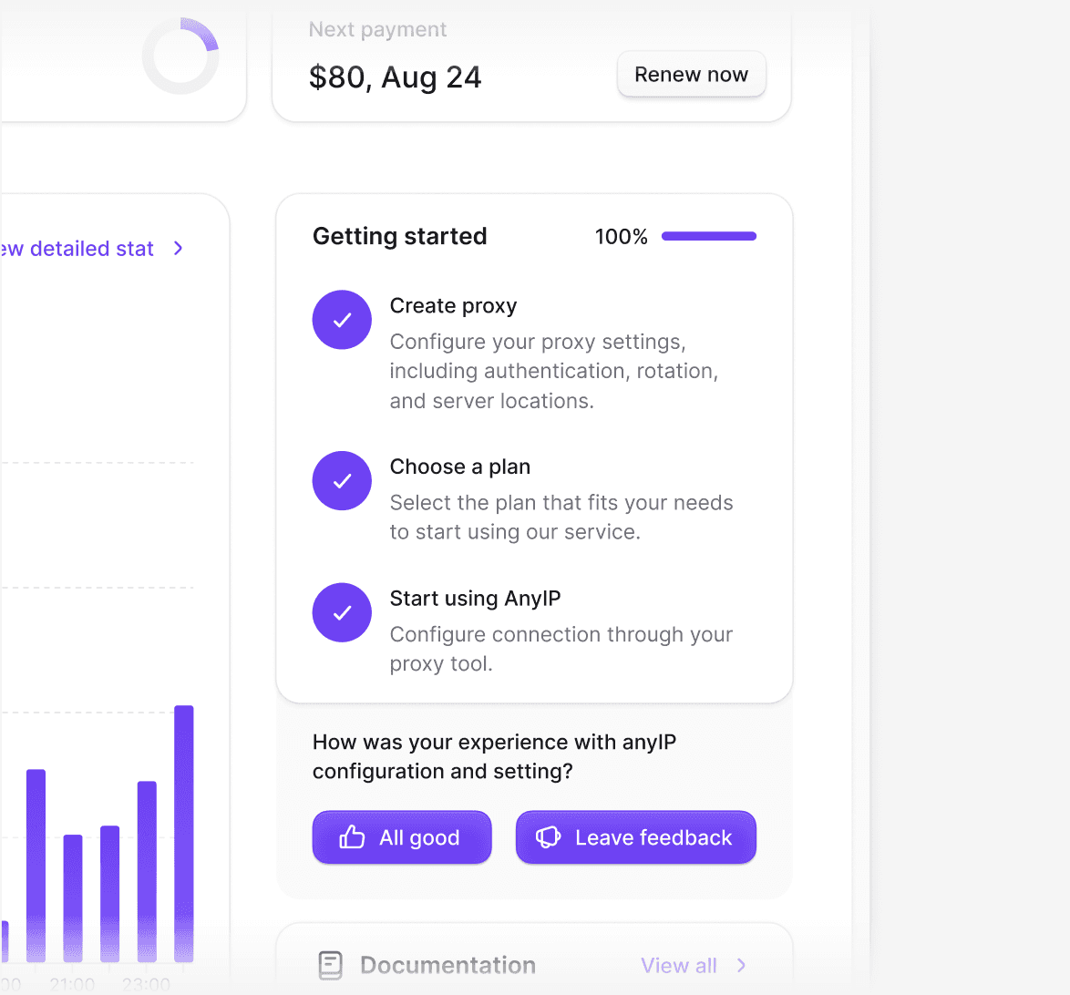
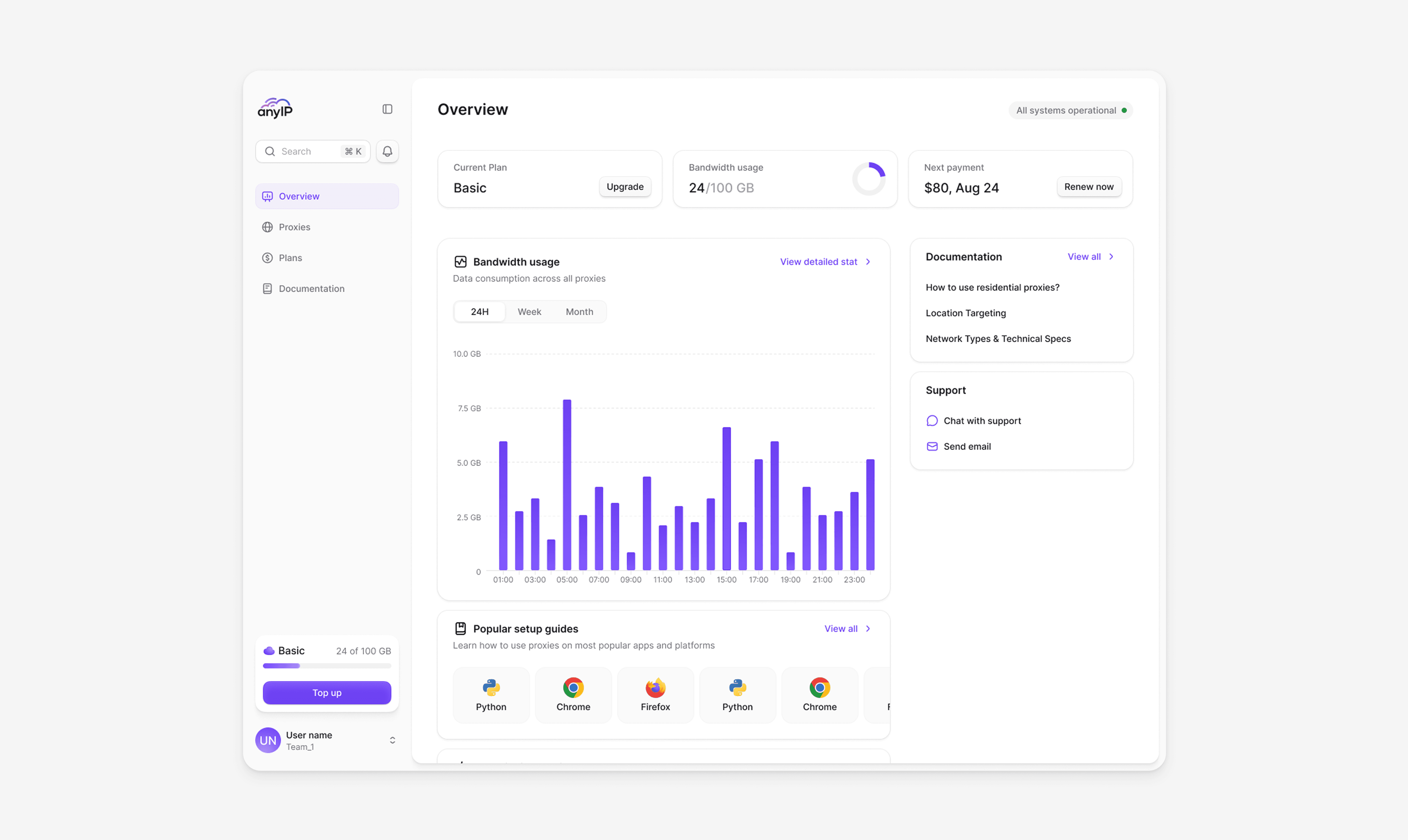
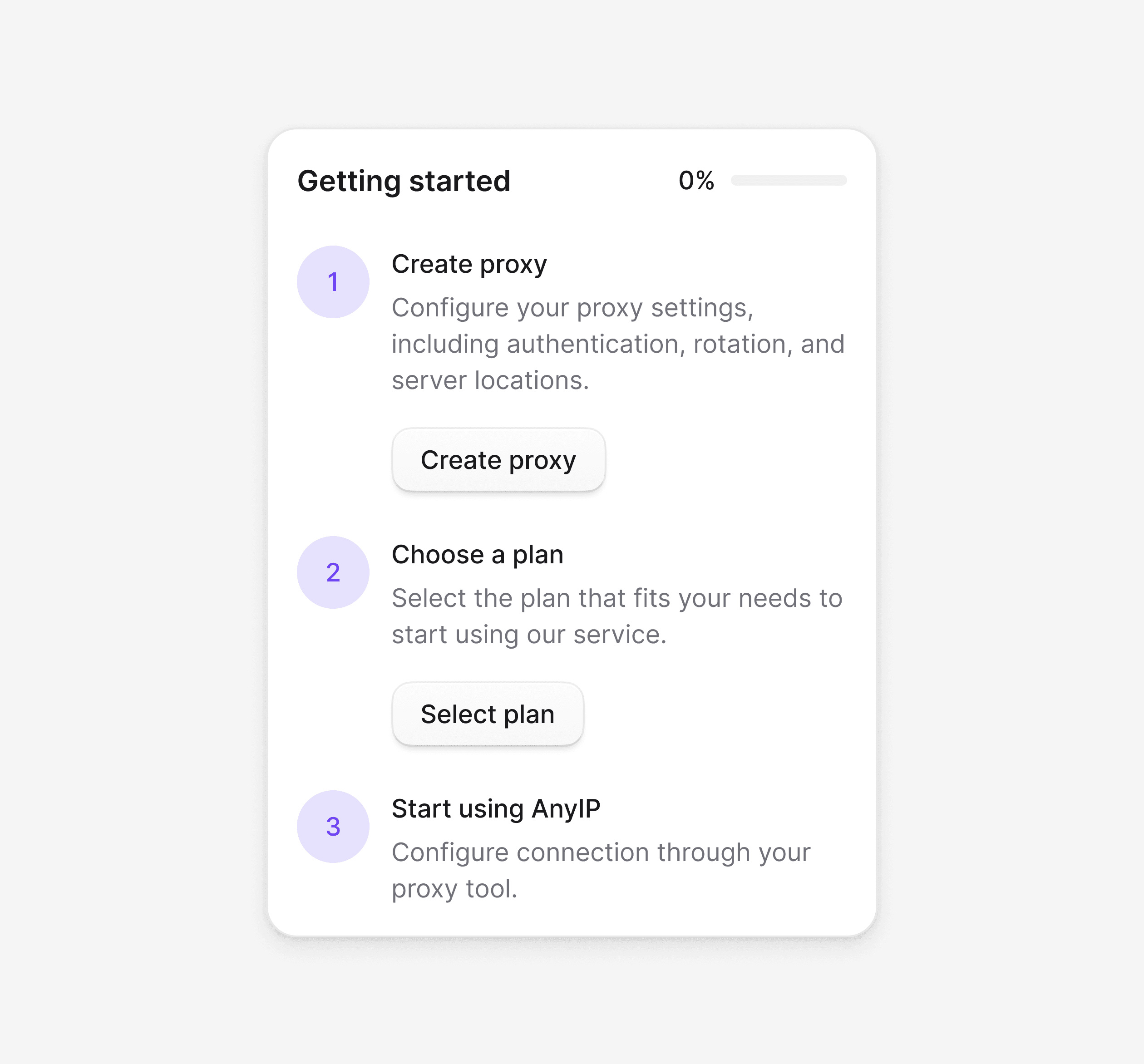
The dashboard is the first thing users see and a key conversion point. We designed it to guide new users toward activation while giving experienced users fast access to what matters. Onboarding steps, setup guidance, and a clear path to purchase are visible from the start.

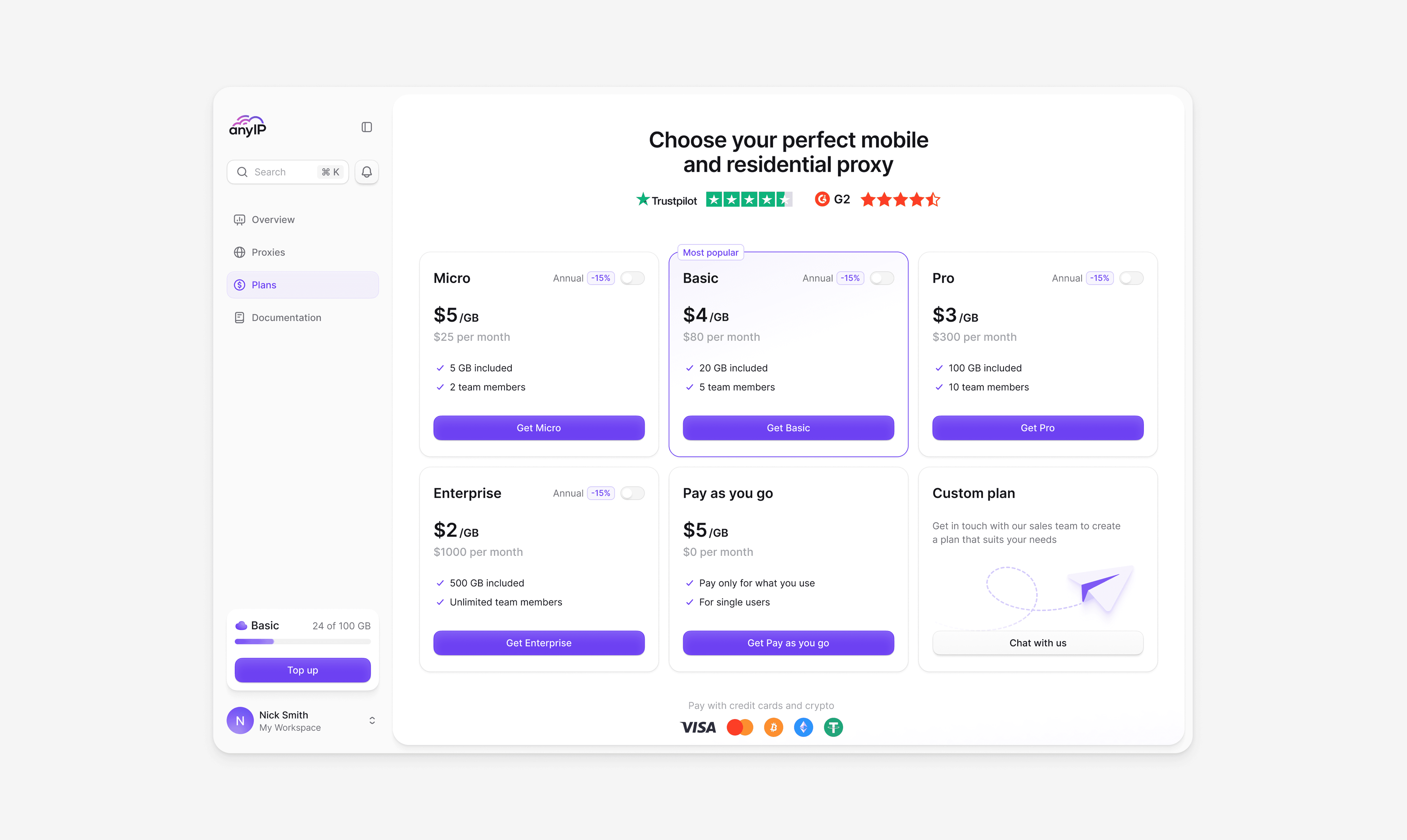
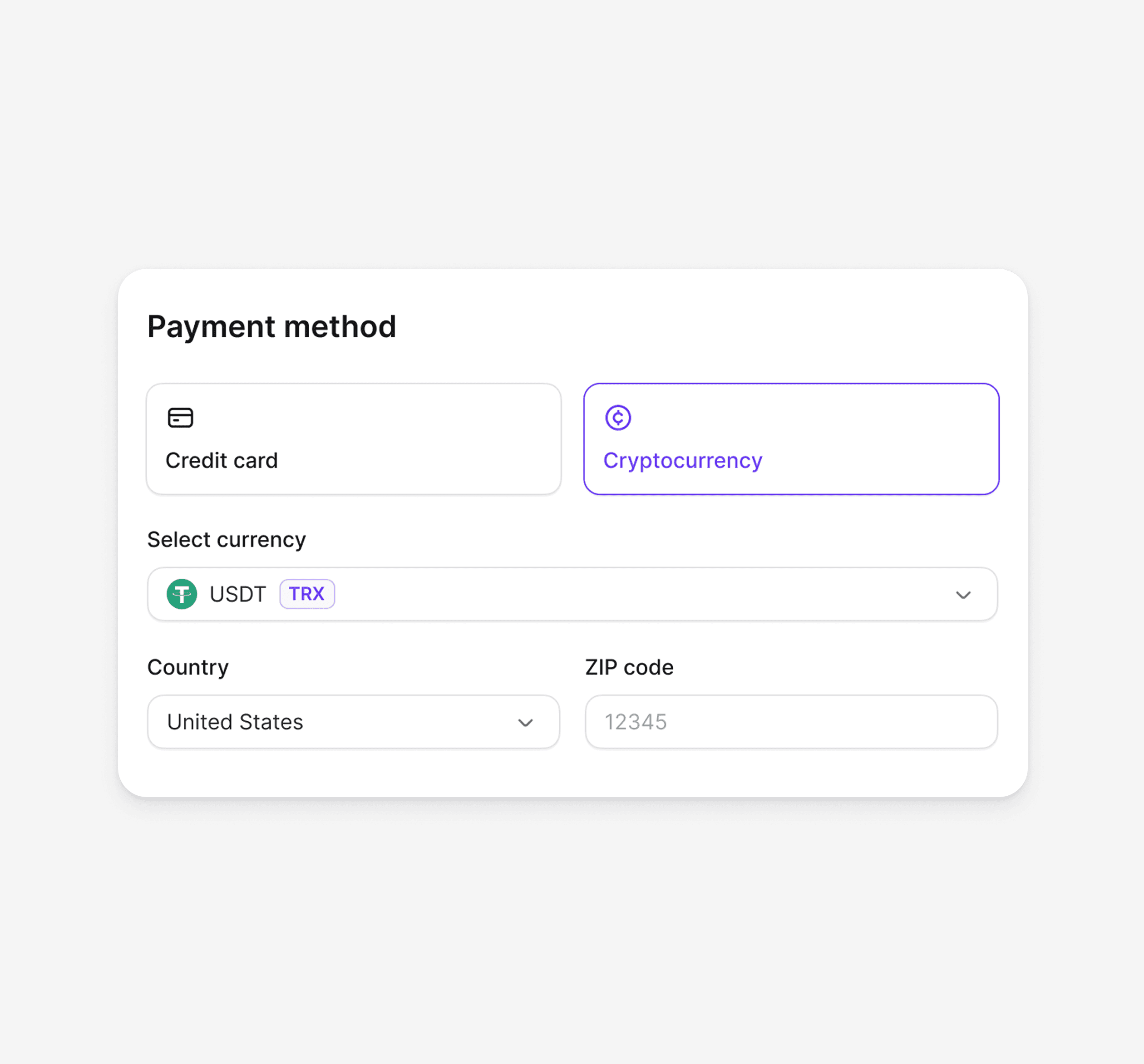
Pricing is structured for quick decision-making. Six plan tiers with clear feature breakdowns, visible discounts, and highlighted recommendations. The payment flow supports cards and crypto from plan selection to confirmation in three steps.


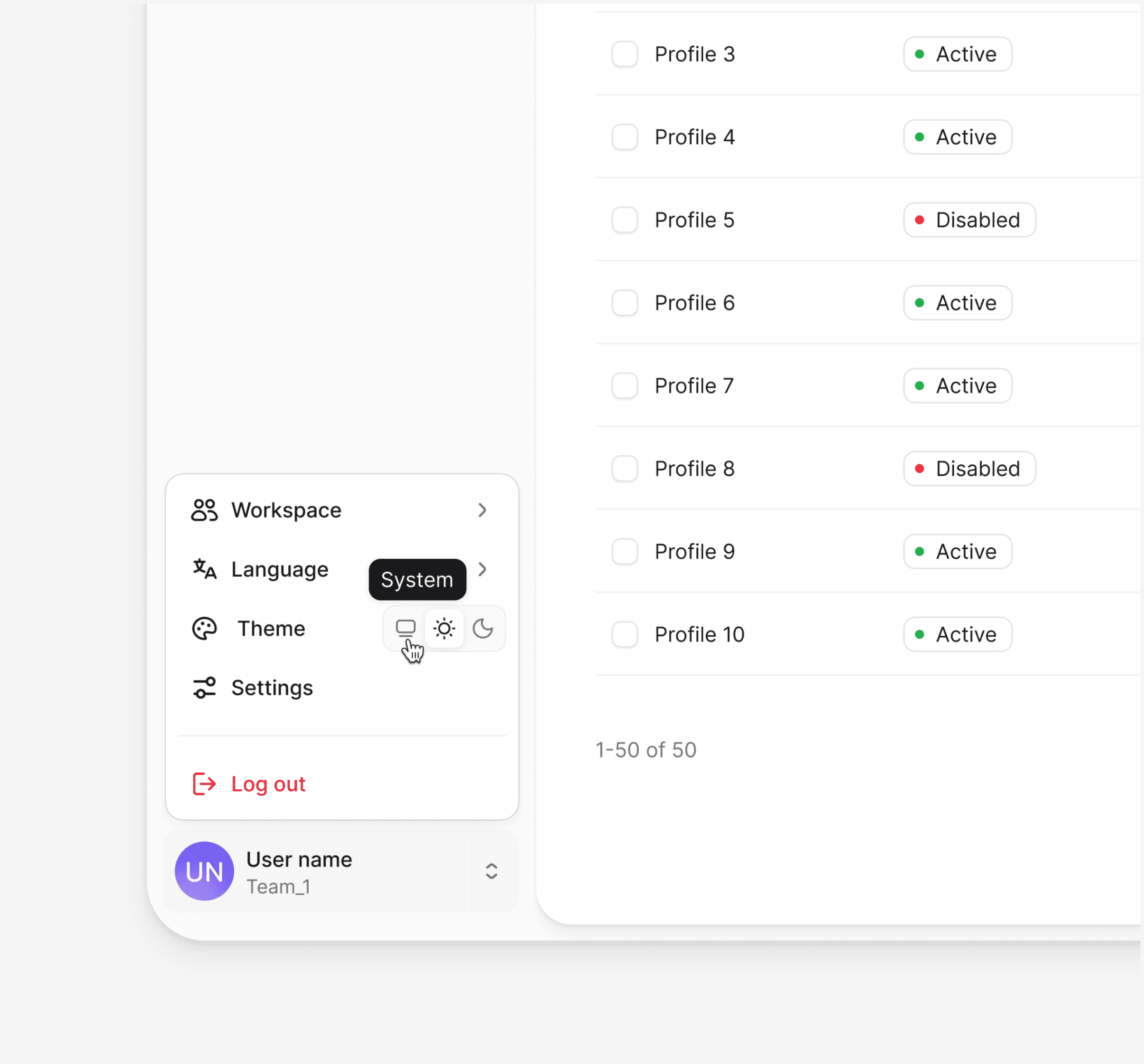
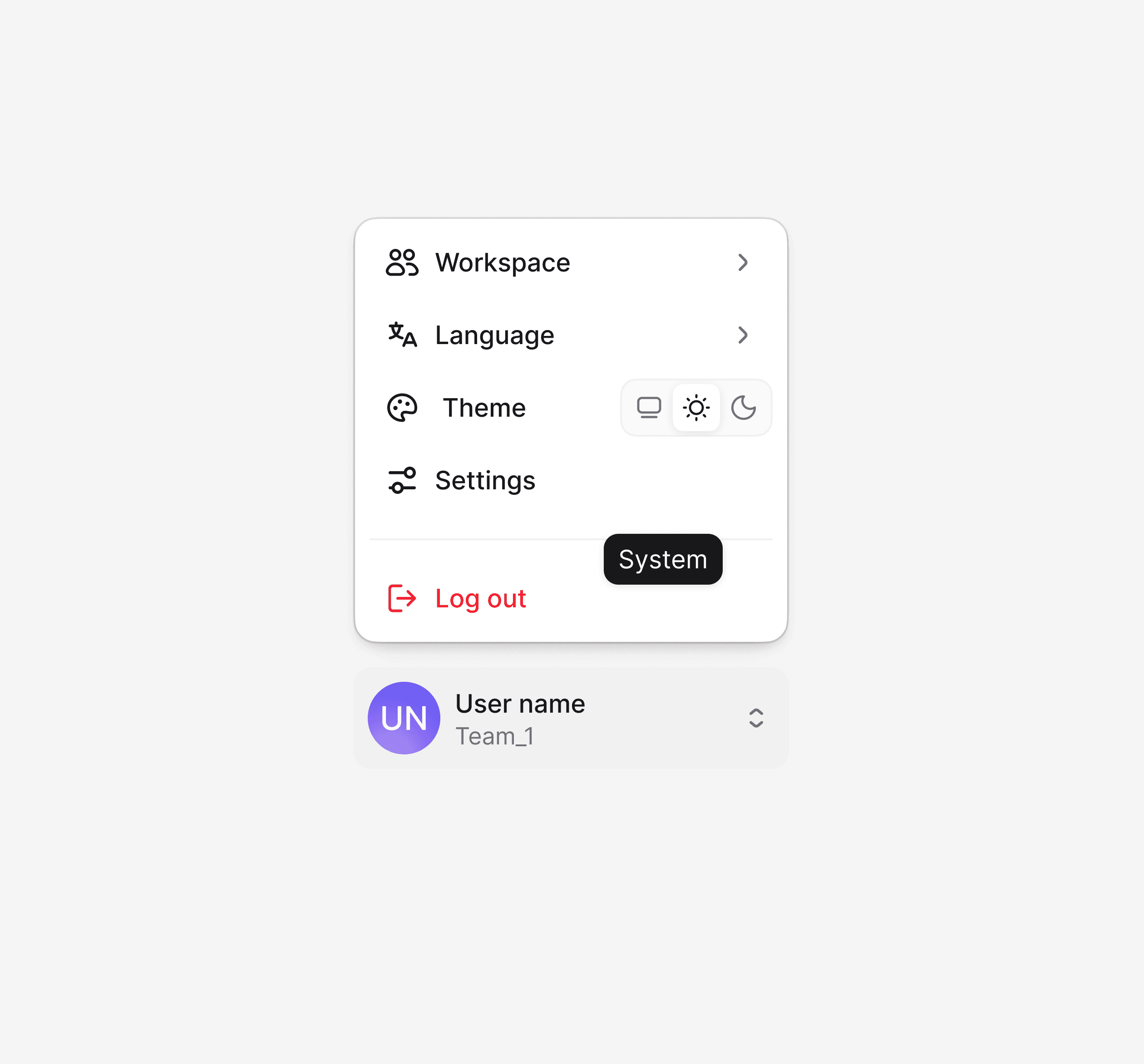
Beyond the core workflows, dozens of additional interface sections were designed with the same systematic approach, each following the established component library and visual language to maintain consistency across the entire product.


The mobile experience was designed around real usage patterns. Layouts adapt to smaller screens while preserving full functionality, without cutting features.


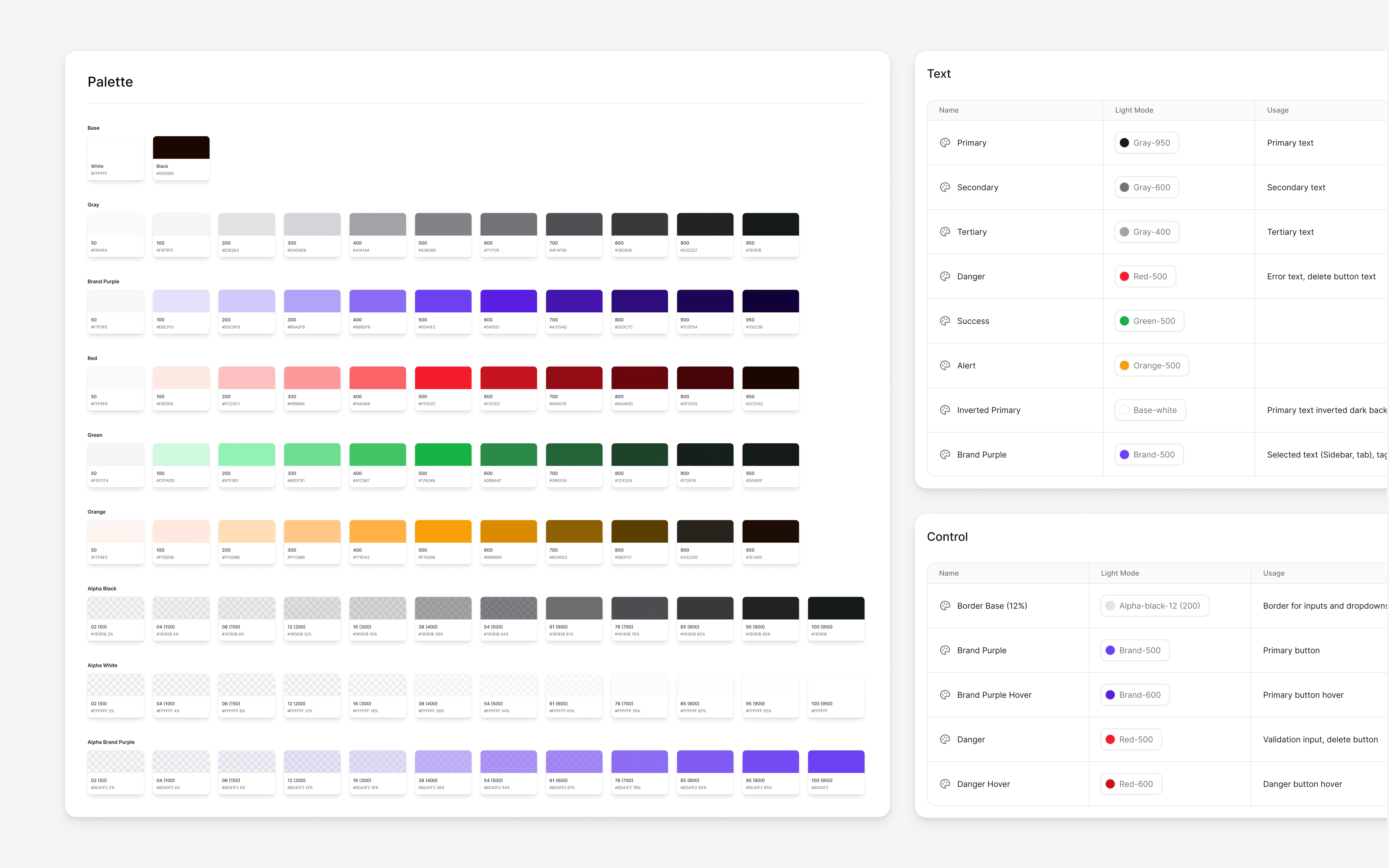
A comprehensive component library built to support scale and speed across 600+ screens. From basic elements to complex data tables, every component follows unified principles, creating a shared system for both designers and developers.


Video preview
Video preview

Khaled Bentoumi
[Anyip co-founder]
